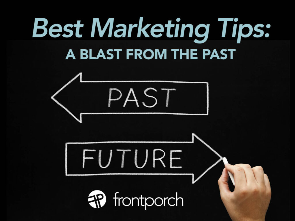
It’s the last post of the year, y’all, time for a round-up of the best marketing tips from our blog. It’s about to be 2026 in a few days, and we’ve accomplished a lot! To move forward to the future of your marketing success, we thought it would be helpful to go back and share some knowledge from the past. Hopefully, this will help you start thinking about what you want your business to be in 2026.
Start the Year With a Marketing Plan
First of all, you don’t know where to start planning for the year ahead? Start with an official marketing plan. Put a document like this together to help guide you through the year. Here are some marketing tip posts:
- Get Started on Your Marketing Plan
- Get Your Marketing Plan Ready
- Business Success: Now is the Time to Plan
Pro Marketing Tip: Strong Branding
Next, does your branding stand for the company the way you want it to? Can you strengthen your brand? Will 2026 be the year for a re-branding to more align your business goals? Here are some branding posts to help you evaluate your situation.
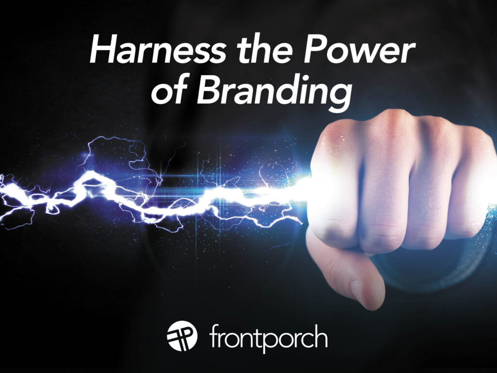
- Harness the Power of Branding
- Begin with Branding: Do You Have a Solid Foundation?
- The Evolution of Your Brand’s Visual Identity
Your Brand’s Voice Has Power — Channel It!
To continue this thought, part of your brand is your voice. The words you use, the story you tell. Are you maximizing that voice in every point of contact? Here are some marketing tips on topics to think about when you are evaluating your content:
- Brand Messaging: How Strategic Word Choice Builds Trust
- The Impact of Brand Storytelling
- Brand Voice: The Importance of Consistent Communication
Tame the Tactics: From Email to Social Media
Finally, need marketing tips on how to do email or newsletter marketing? Social media posting? We’ve got you covered. Get started by checking out these post for information, or advancing your digital marketing prowess this year:
- Engage Customers With These 3 Smart Email Marketing Strategies
- Using Scroll-Stopping Content to Hook Your Audience
- How to Increase Traffic to Your Company Blog
For More Helpful Marketing Tips, Check Our Blog
Overall, we might have covered just about every every marketing topic that a small business could use to grow their brand. Because, we’ve been creating content on our blog for over a decade! Find a nugget or two in there to help you get started. If you want to subscribe to the blog and get a tip post every week next year, just subscribe here. If you have questions, be sure to holler.