

Tag Archives: visual branding

Quickly developing technology and an infinite number of daily distractions are making it considerably harder to capture consumer attention. The solution? Using composition methods like balance and visual guides to captivate viewers so the storytelling can begin.

Why Do We Need to Enhance Content?

Technology has a way of both engaging and disengaging society. As new entertainment and services become increasingly more accessible and convenient, people learn to expect immediate gratification and quickly lose interest in activities that require patience, sustained attention, or effort.

One of the most widely cited examples: scrolling on social media. Since the algorithms use strategically personalized content to trap users in dopamine-driven reward loops, other daily tasks can’t compare. AI, one of the newest inventions to society, poses similar issues. Why would someone dedicate hours to writing emails, brainstorming designs, or researching topics if it can be done in 5 minutes with minimal work required? The same is true for delivery services. With groceries, meals, clothes, and products at people’s fingertips, it’s hard to see the appeal of going places in person.

However, technology doesn’t only disengage people from society, it also disengages them from the technology itself. As novelty wears off, people come to expect optimized convenience and speed – minimum effort for maximum reward. Although social media may captivate someone’s attention for hours, the longer they scroll, typically the more bored they become. When AI doesn’t generate a satisfactory response, people who expect instant, high-quality results become easily frustrated. Delivery app customers grow impatient with wait times that previously seemed remarkably fast.

Enter marketing. It’s here, in all this noise, that marketing has to compete for consumer attention. What poses an even greater challenge is that one of marketing’s greatest strengths is storytelling. As people become even more particular with what they deem is worth their attention, how do you convince them that your story is worth it?  My suggestion: using a combination of the composition techniques described below to enhance your content.

Balance Visual Weight

Arguably, balance is one of the most crucial composition techniques, because if your design seems messy, the viewer’s first instinct will be to look away. Instead, a designer’s goal is to make it easy for a viewer to interpret an image, while also keeping the elements interesting enough to hold their attention.

In total, there’s three types of balance: symmetrical, radial, and asymmetrical. Symmetrical balance typically acts as a crutch for most designers, because it is one of the easiest ways to assess if your design is balanced. Typically, as long as all your elements are center-aligned or mirrored on both sides, the result is an overall pleasing visual. Although it is less familiar to most, radial balance is also very comfortable because it involves arranging elements around a center point, so it naturally has many patterns.

With these two alternatives, many people may steer away from using asymmetrical balance, because it can be less straightforward and more time consuming. To make the process easier, I like to lean on the rule of thirds, which I learned while studying photography. The basic principle of the rule of thirds is to divide an image into a three-by-three grid and align the main elements on the intersection of your lines. Although using the rule of thirds does not guarantee asymmetrical balance, it is often an effective starting point for creating it.

Direct Attention with Visual Guides

After creating a balanced image, you want to draw attention to your main subject using visual guides. Again, there are many ways to direct attention, and this composition technique may be applied through a variety of ways.

Leading lines, framing, and depth of field are three popular visual guide techniques for photography. Leading lines involves using lines found naturally in your shooting location to draw attention toward the main subject. Lines can be horizontal, vertical, diagonal or even curved and include both natural and man-made objects. For example, roads, architecture, and mountains can all act as leading lines toward a main subject. Framing shares a similar concept to leading lines, but instead of creating movement through the image, it uses objects to surround and isolate a main subject. Try to lean into storytelling when using framing, by selecting objects that are relevant to your message.

For example, an ornate door or arch provides a sophisticated look, while elements like branches give a sense of calmness. If a shooting environment doesn’t naturally allow leading lines or framing, depth of field is another great method to use when directing attention. By using various camera settings to blur out the background, a photographer can highlight the main subject by keeping it in focus.

Outside of photography, there are many other ways to draw attention to a main subject. Often, designers will use contrast and scale to make certain elements stand out more than others. For example, a common method is using a pop of color in a black and white design to fixate attention on the object in color. Another method is making one element considerably larger than surrounding objects to emphasize an image or text.

Drive Brand Messaging through Storytelling

Although these composition methods help grab and direct attention, ultimately, it’s the message that turns clicks into customers. While creating aesthetically pleasing designs is an important part of storytelling, it is only one piece of the puzzle. To effectively communicate a brand’s message, marketers must showcase not only a product but also an outcome. When combined with strong content, composition techniques can transform a message from something viewers simply see into something they feel, experience, and remember.


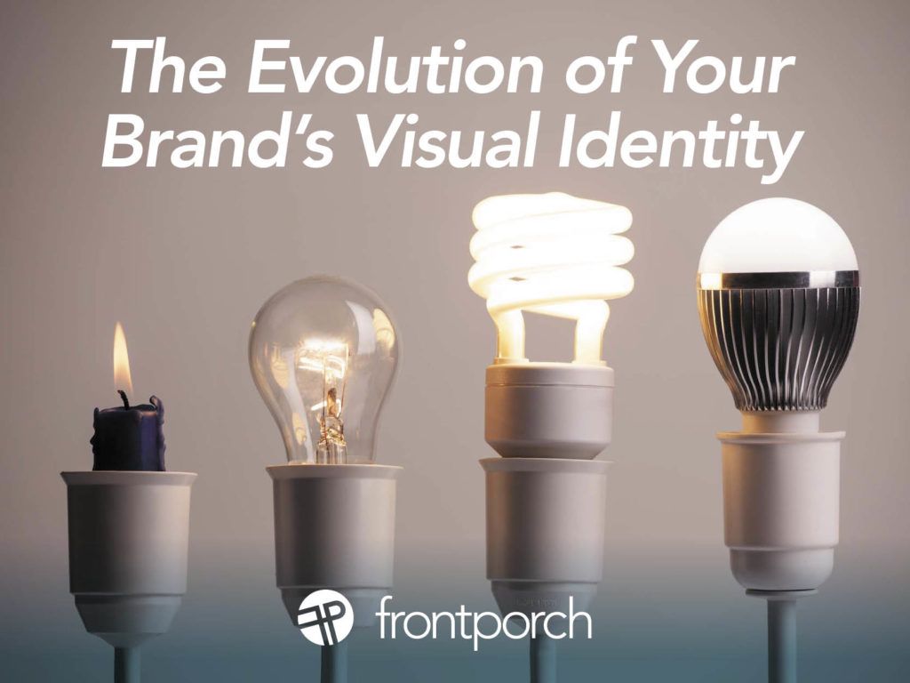
A brand’s visual identity is more than a logo or color palette —  it’s the visual representation your business’s values, mission, and personality. For small businesses and non-profits, a well-crafted identity builds recognition and trust. However, as these organizations grow and evolve, branding may need to change to reflect new goals, audiences, or offerings.

Why Evolve Your Visual Identity?

The decision to update or overhaul a visual identity often stems from growth or change. Here are key reasons a brand might evolve:

  1. Business Expansion: As businesses introduce new services or products, their branding may no longer reflect the full scope of their offerings.
  2. Shifting Target Audience: As the organization grows, its audience may broaden, requiring visuals that appeal to a wider or different demographic.
  3. Modernization: Visual trends change over time, and keeping a brand fresh ensures it remains relevant.
  4. Increased Professionalism: Many small businesses and non-profits start with DIY branding. As they mature, a polished identity can better reflect their level of professionalism, and dial up the credibility.

Key Elements of a Visual Identity

When evolving a brand’s visual identity, several components come into play:

1. Logo

The logo is the anchor of a brand’s visual identity. A redesign might simplify or modernize it while maintaining familiar elements for consistency. Updating or streamlining symbols can make a logo more versatile and contemporary.

2. Color Palette

Color evokes emotion and conveys values. Refreshing a brand’s color palette can help better align it with the organization’s current mission. Updating colors to align with trends can also modernize a brand’s visual identity.

3. Typography

Fonts communicate personality and tone. As businesses mature, they may shift from playful fonts to more professional ones. Introducing new fonts or pairing complementary styles can enhance both readability and brand perception.

4. Imagery and Graphics

Visuals, such as icons and patterns, help communicate the brand’s personality. Evolving these elements to align with the brand’s current focus ensures a cohesive look. For instance, non-profits may shift from abstract graphics to real-world photography as they grow their impact.

The Visual Identity Refresh vs. Rebrand

When evolving a visual identity, it’s important to determine whether your organization needs a refresh or a full rebrand. A refresh updates key elements (like colors or fonts) while keeping the core identity intact. This option is ideal for businesses looking to modernize without losing recognition. A rebrand is a complete overhaul, suitable for organizations undergoing significant shifts in their focus or mission.

Impact of a Refreshed Visual Identity

A refreshed visual identity signals growth and professionalism. It can attract new customers or supporters and keep your existing audience engaged. Modernizing your brand positions you as adaptable and forward-thinking, creating stronger emotional connections with your audience. Evolving with purpose is the goal.

For small businesses and non-profits, evolving a brand’s visual identity is about aligning with new goals and audiences. Thoughtful updates can amplify your message, improve recognition, and ultimately lead to greater success. Whether you’re expanding your business or growing your non-profit’s impact, evolving your visual identity ensures you stay relevant and resonate with the people you serve.