Tag Archives: logo

There comes a time in every company’s life when their logo might need a little freshening up. Maybe it looks dated. Or it no longer reflects your company. Maybe your logo looked great on your original product, but it no longer works for what you manufacture now.

Take a page from logo makeovers past and ask yourself, “What does your logo communicate now?”

Your Logo No Longer Works with Your Products

Imagine pairing Apple’s first iteration of their iconic apple-shaped logo, the rainbow-striped apple, with the first-generation iMac. The iMac debuted in 1998 and was a colorful departure from the standard boxy, beige and gray computers of the time. If Apple stuck with their rainbow-striped logo, the result would have been a product that looked more like a child’s toy than a high-tech computer.

Does your logo “play well” with your existing products? If not, it might be time to thank it for its service and toss out the elements of your logo that no longer work for you.

imac apple logo and old rainbow apple logo

Your Logo Looks Dated – Burger King Edition

All design reflects its time and if your logo reflects the last century, then perhaps it’s time to give your logo a second look.

Let’s take a look at the recent Burger King rebrand. Their logo was designed in 1999 and it looks like it. Their old logo reminds me of ‘90s sports team logos – modern, lots of dynamic movement and some sharp edges. You know, everything you want in your food. 🤷‍♀️

Their new logo is simpler, puts the burger front and center and it looks friendlier. Plus, it looks great on a small screen. Brands must think about where their logo is going to live and if that logo doesn’t look good blown up on a billboard or shrunk down to the size of an app icon, then it might be time for a change.

Your Logo Looks Dated and it No Longer Works with Your Products – Instagram Edition

Remember when app icons used to be skeuomorphic? That is, they were designed to look like the thing they represent. i.e. The recycling bin icon on your desktop that looks like an actual recycling bin. Software designers used skeuomorphism as a shorthand way to get people acclimated to using computers and other digital devices. Picture what the old iPhone icons and interface used to look like – if you wanted to look at your contacts, you tapped on the icon that looked like an address book. When you opened your notes, the screen looked like a yellow notepad.  

But there are times when skeuomorphic design can go off the rails a little. What happens when users no longer use the things these icons are meant to represent? Exhibit A, the “Save” icon in Word – it looks like a disk that I used to tote around in high school.  How are users supposed to know to click on that icon to save their document? Answer: users just learn over time that’s what you need to click on, but I wouldn’t call that very user-friendly or intuitive.

Skeuomorphic design can also look messy and cluttered. Users could see more of their contacts if the interface did not look like a literal address book

There is a reason why app icons became more and more “flat” and minimalist over time – its easier to see them on a mobile device. Which brings me to Instagram.

In 2016, Instagram changed their logo from an icon that looked reminiscent of an old Polaroid camera to what it is today, a minimalist representation of a camera with a colorful gradient background. And the internet, of course, had some thoughts:

“The new Instagram logo looks like a rejected starburst flavor.”

@trecoast

Okay, so the new logo was not universally loved. But, in the end, things turned out alright for Instagram. One, because its Instagram, a photo-taking juggernaut of an app that managed to tap into humanity’s need to take selfies and shill vitamin gummies. And, because their new logo:

Made them stand out from the rest of the apps on your phone.

Have you ever noticed that a lot of app icons are blue? Don’t believe me? Take a look at this:

So. Many. Blue. App Icons.

Gave them a unifying design language they could use across their app, creating a better user-experience.

Instead of making each function of the app a literal representation, i.e. a boomerang icon in the shape of a boomerang, they could now be designed to represent their use. Which is why the boomerang function in Instagram looks like an infinity symbol because it replays a short video over and over again. A good logo gives a company different ways to talk about itself visually.

A bad logo can limit a company’s design choices. For instance, if your company’s logo features a gradient, its going to be difficult to embroider that logo on a shirt. If you can’t reverse your logo i.e. it looks the same in black-on-white as it does in white-on-black, then that really limits your design options.

You might find that you can only put your logo on a light background. Which isn’t the end of the world. But if you want to put your logo on say, a photo of a manufacturing facility in motion, then that photo had better be light and bright or it will get lost in the darkness.

Plays well in all sorts of uses.

For example, if you want people to use your app, it would be best to create a simple logo that can be slapped onto a flier, a business card, a website etc, and still look good. Imagine if Instagram still used their old logo and how that little brown polaroid would look on a business card or the bottom of a flier. Which is easier to for the average person to identify, that camera or the “rejected starburst flavor?”


Most companies do not fail or succeed based on their logo. Quality design is an investment, one that you might not have the resources for right now. But a logo can communicate more to your customers than a thousand commercials ever will.

What does your logo communicate to your current and potential customers? Is that the message you want to send? Or is it time for a refresh?


A great logo makes your business. It serves as your abbreviated calling card, and speaks to your company’s culture, beliefs, and defining qualities without explanation. Add in color, font and unique graphical aspects and your logo becomes your brand.

“Your brand’s logo is the sort of thing that can have a bigger effect on your business than you first think,” says John Rampton of Forbes. “The wrong logo can make your brand come off as unprofessional, assuming anyone notices you at all. A good logo will create instant recognition within the minds of your target audience.”

Your logo should be unique, memorable, timeless, and versatile. It should stand out in the market. And it should represent your business and its message.

So you have an amazing logo!?!? NOW WHAT? Two simple but surprisingly difficult ideas:

Protect and Share.

On repeat. Make it your 2018 chorus.

From pictograms, ideograms, hieroglyphs to today’s world of avatars, emojis and icons, it can get confusing fast. If you are in a sea of sameness, unprotected and using your marks haphazardly, you are dead in the water.

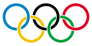
Your logo usage must be easy, clear, and second nature. Take the Olympic rings, for example. No one mistakes them, everyone knows exactly what they represent, and what time it is when you see them. You can even hear the song in your head, can’t you? No questions. Put your logo under that filter. Every time you put it in play.

If you don’t diligently protect your marks, you are wasting effort.

So how do you protect your logo? You have standards, you have guidelines, you have a playbook and you follow it. No. Matter. What.

Remember, strong brands are:

  • consistent at every touchpoint
  • supported by strong teams
  • not forced
  • protective of their image

So in 2018, protect that brand. Share it. And do it again and again. As always, we can help!


Ah … summer approaches with new business happenings and the sounds of the beach in our ears. We love this time of year on the Porch. The days are long, the sound of little Porch Rockers fills the air and we feel a summer six pack is in order!

Friends, are you ready for summer?

Pull up a chair, will you?

Our Summer Six Pack of New Business Happenings:new business front porch marketing

  • New Ways to Sell: We are constantly assessing and reassessing our methods in search of new ways to grow our client’s influence, customer base and ultimately, their sales. Right now we are all about social selling on Facebook, Twitter, LinkedIn and Instagram. We believe in the power of developing client-customer relationships via social media.
  • New Blogs: Speaking of power, we are beginning niche blogging for FPM this summer in order to harness its power for top-line growth. Interested in doing the same for your business? Give us a ring.
  • New Clients: Our favorite “new” is new clients! We have many new business partners this year and one of our faves is Maplewood Investment Advisors. Maplewood is a full-service brokerage firm that offers personalized investment expertise to individuals and institutional clients. Maplewood is a mosaic of multiple investment teams, which allows them to provide dynamic investment flexibility and comprehensive client services. We are looking forward to rockin’ it with this fantastic new client.
  • Renewals: We sent in our application to renew our WBENC membership. An added bonus? We are so excited that the Women’s Business Council – Southwest is OUR client.
  • New Job: Front Porch is proud of our interns. Our Rocketeer, Grace Dominique, has just graduated from Texas Christian University and landed a job working with Simpli.fi, a data marketing agency, managing west coast operations from the Fort Worth location. She will be an Account Coordinator with great opportunities for travel and client facing work. Congrats, Grace!
  • New Lil’ Rocker: There’s nothing better or more heartwarming than a brand new baby, and we are excited to announce a new one in our midst! Our very own Rockin’ Roller, Ann Marie Bishop, recently gave birth to son Finley and we welcome this new Lil’ Rocker with a lot of love.

That’s our summer six pack, friends.

We hope your summer is full of new business and more!

Join our blog nation here, follow us on Twitter, Facebook, Instagram and LinkedIn!


Spring has sprung and Q1 2017 branding and marketing is about to come to end, friends! We love the feel of the sun on our shoulders, all the blooming going on around us, and the hopeful smile that the season puts on our faces! We are happy and excited about, well, everything!

Here is what we have to share:

We’re Having a Contest!

As you know, we are celebrating our sixth year in business with our own version of “Pick Six.” Well this month, in celebration of spring and our giving spirit, we are taking the Pick Six to you, our clients and friends! Be among the first six to reply “Please Rock My World” and you will receive six free social media posts for your business on one social media platform of your choice!

  • Six Winners
  • Six Free Rockin’ Social Media Posts
  • Six Expert Rockers posting
  • Six Days in April
  • Winners will be contacted on April 6th!

Front Porch Marketing Q1 2017 Branding & Marketing Review

April is the absolute perfect time to review your Q1 branding and marketing efforts. Are you meeting your goals? If not, it’s time to quickly re-collaborate for Q2. Here is a refresher on metrics vs. analytics. Call us if you need to take an objective look at your results.

SEO and PPC Benefits

When it comes to boosting traffic to your website, Search Engine Optimization (SEO) and Pay Per Click (PPC) are hugely beneficial. Need further convincing? Call us. We would love to chat about it. We are currently rockin’ it for our new clients OLLI at UNT and Women’s Business Council Southwest and loving every minute of it!

Fresh Branding and Marketing Initiatives

Spring into your next marketing initiative with a fresh brand look and feel. Why not update your marketing material creative and messaging? We are proud to partner with new client Owens Machine and Tool Company to do just that for a recent trade show.

Texas CEOs Rock!Q1 2017 Branding

Our Chief Rocker heard a refreshing and uplifting outlook on the Texas economy for 2017 and 2018 recently at the 2017 Vistage Executive Summit by Alex Chausovksy, senior analyst, ITR Economics. Also at the Vistage Summit, Roy Spence, co-founder and chairman, GSD&M, shared key insights and lessons from legendary, purpose-inspired leaders he’s worked with over the years. He presented actionable ideas to inform making decisions that support your Core Purpose. Decisions that build a business—and a life—of success.

As Always …

We are grateful for so many things – a Q1 2017 branding and marketing jam, our rockin’ team, amazing clients, faithful advocates, collaborative partners and truly great friends. Thank you for the many referrals! Keep them coming!

Follow us! Join our blog nation here, follow us on Twitter, Facebook, Instagram and LinkedIn!