It’s not easy being green.
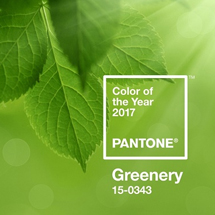
Or is it? The Pantone Color Institute has announced that Greenery is the official 2017 color of the year, number 15-0343 to be exact. And as a graphic designer, there is nothing I love more than a new source of inspiration.
 In the world of marketing, color has a way of evoking feelings and attitudes toward companies and their brands that words can never quite achieve on their own. Color brings about meanings and connotations that cause the viewer to associate that brand with their unique personal experiences. Whether it’s the specific Pantone shade you have chosen for your company logo, the background hue of your website, or the paint on the walls of your store, color is powerful and can have an immense impact on the way customers perceive your company.
To complicate it even more, color works in harmony with shapes, graphics, and images to portray your brand or company. Color can increase brand recognition and symbolize meaning behind words. A fiery red portrays vibrancy and energy, while a cool blue conveys relaxation, loyalty, and tranquility. Even the names of colors matter. Research has shown that people prefer a mocha sweater over a brown one, and lemon colored plates over yellow ones. Even when they’re the exact same shade! There is actually a chemical reaction in the human brain that produces an emotional response to color. This reaction triggers various thoughts, memories, and associations. And when it comes to your brand, of course you want to make sure you are triggering the reactions you are looking for.
But what about this fresh new hue? What does green represent? It’s known for all kinds of things! A green traffic light means go. “Going green” means being environmentally conscious and recycling. “Feeling green” can mean you are sick, and “green with envy” symbolizes jealousy. Green also represents growth and rebirth. But what about this particular shade? Pantone describes Greenery as a refreshing and revitalizing shade, and symbolic of new beginnings. They say it is a fresh and zesty yellow-green shade that evokes the first days of spring when nature’s greens revive, restore and renew. Illustrative of flourishing foliage and the lushness of the great outdoors, the fortifying attributes of Greenery signals consumers to take a deep breath, oxygenate and reinvigorate. What a rich and inspirational color!
Here’s a fun fact: did you know that there are more shades of green than any other color? Think of all the shades out there: lime green, avocado green, army green, emerald green, grass green, to name a few. There are so many green things to love:
- Green foods, like avocados, zucchini, broccoli, cucumbers, kiwis, limes, pickles, pears, and even green M&M’s (Legend has it that they are an aphrodisiac, or so we hear!)
- Lucky four-leaf clovers, and leprechauns on St. Patrick’s Day
- Sparkling green emeralds
- Evergreen trees, fields of grass, and lush foliage outdoors
- Green animals, such as frogs, geckos, turtles, lizards, snakes (ok, maybe not snakes)
- Money, also called greenbacks
- Legendary characters like the Incredible Hulk, the Grinch, Peter Pan, Shrek, the Jolly Green Giant, and Kermit the Frog
A few of our other favorite green things, here on the Porch:
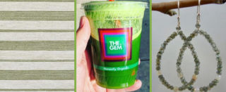
Feizy green pin-striped rug (Duprine Collection), green juice from The Gem, and green jewelry from Ellen Hoffman Designs. We love green so much on The Porch, we even rocked it for our most recent team photo.
So next time you’re thinking green, or feeling green, or seeing green, try to remember how much color matters, and what it can do for you and your company. It is always smart to consider whether it’s a good time to rebrand yourself. What color is going to be the source of inspiration for your brand this year?